The shape of your canvas matters.
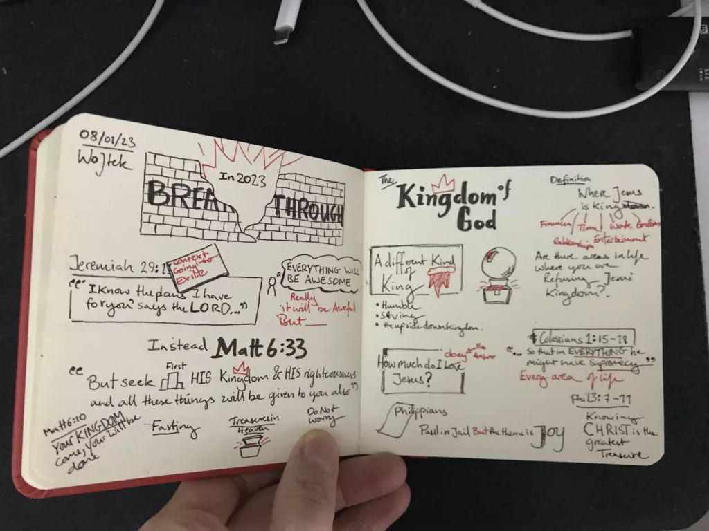
During the last 6 months, I’ve experimented with 3 sketchnote notebooks as I looked for the perfect canvas for my ideas. Square, vertical, and horizontal layouts each have unique strengths and weaknesses when it comes to capturing and organising information.
By understanding how these formats impact my sketchnotes, I’ve been able to tailor my work to different purposes and audiences.
Square: The Playground for Creativity
Instagram hooked me on the square format.

The (previously) native form factor made it my go-to choice for digital sketchnotes of shorter ideas like podcasts. But the square format encourages certain layouts — grid, radial, key image and popcorn — over others.
Because it is less common than classic letter size pages, it stands out and can make you feel more creative.
Vertical: Embracing Structure and Hierarchy
Vertical is what most students are used to.
But I had rejected it for a long-time as it felt too “normal”. Recently, I’ve come back to using a vertical notebook and I noticed it pushed me to more linear and hierarchical structures (it’s actually the inspiration for this essay). This format has been particularly useful when I’m sketchnoting a presentation or lecture, where information often follows a top-to-bottom progression.
The Sketchnote Ideabook has been my go-to choice for vertical sketchnotes.
Horizontal: The Panoramic Storyteller
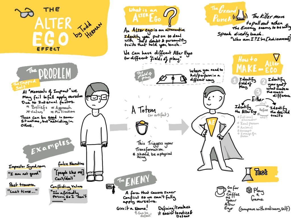
Horizontal layouts are my favourite digital format for sketchnote book summaries.

I’ve found they work great for illustrating a story or a process with a natural flow — they work great with the path layout. They also work well with transformations from a before to an after state. Plus they work well for facilitating and following a conversation with a journey.
If you always use one format of paper, try using a different one. It might just help unlock your thinking in a new way.

Leave a Reply