Want to add people in your sketchnotes but the results never match your mental picture?
You’re not alone. I felt that way for a while too.
But the good news is that with just a few simple techniques, you can draw sketchnotes people with ease. Even if you believe you can’t draw, you can use these approaches straight away. And you’ll be able to do a lot more as you practice.
Ready to dive in?
Why drawing people is useful for sketchnotes
People add a lot to sketchnotes.
They can
- show emotions,
- demonstrate actions
- and represent individuals and groups.
Ultimately, they make us more connected to the content that we see and help us picture ourselves or others in the situation. It’s no surprise they are one of the most common elements in sketchnotes.
And being able to draw them can really enhance your sketchnotes
A quick lesson on the basic elements of drawing
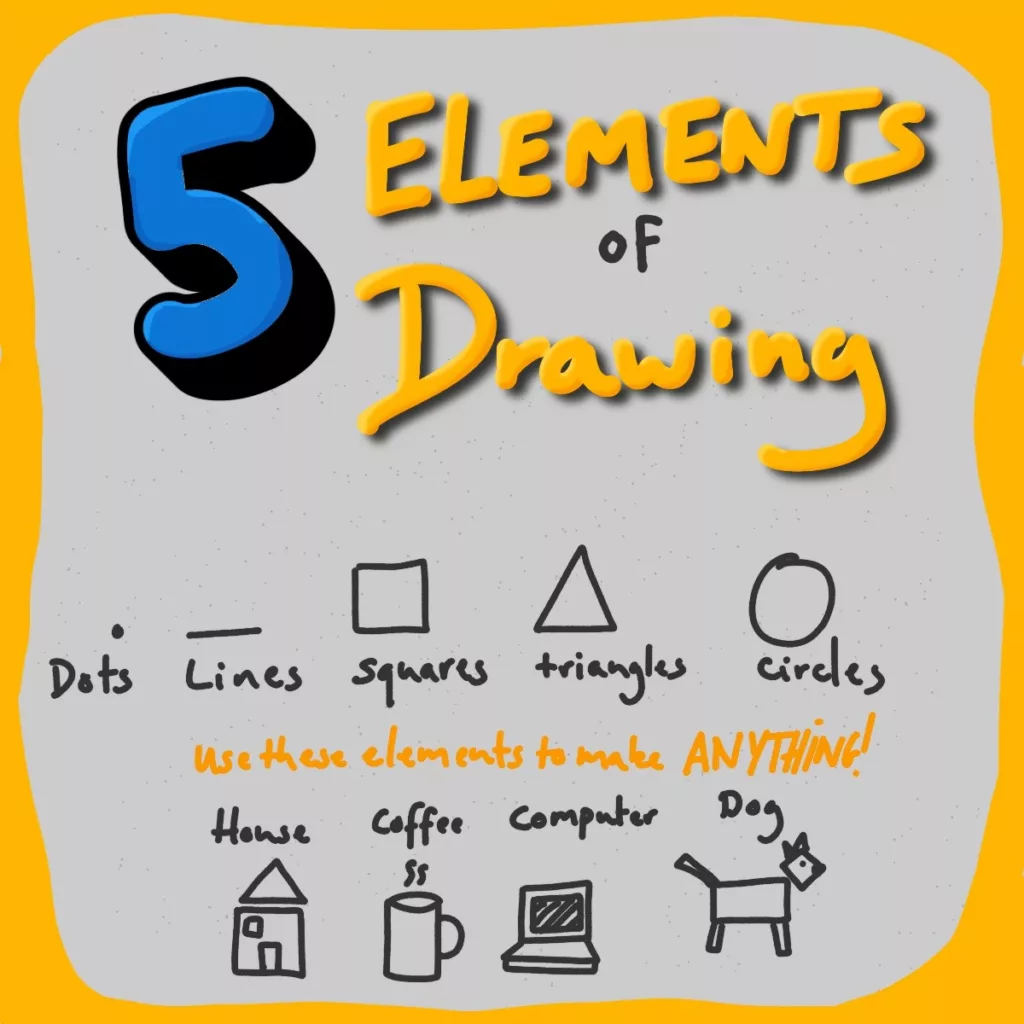
Before we dive into how to draw people, let’s recap the basic of how to draw simple sketches using the visual alphabet.
The visual alphabet is a set of five items (lines, dots, circles, triangles and squares) that allow us to draw practically anything. By identifying these items in a shape, we can simplify what we need to draw. This is just as true when we draw people as when we draw sketchnote icons.
With that out of the way, we can start exploring some simple approaches to drawing people.
6 simple approaches to drawing people
Although there are hundreds of drawing techniques and styles for represnting people, these are the most common ways to use in sketchnotes.
You don’t have to stick to them (if you want a cubist portrait, go for it!) but they are all quick and easy to do especially if you struggle with sketching.
The U person
Probably the simplest way to draw a person.
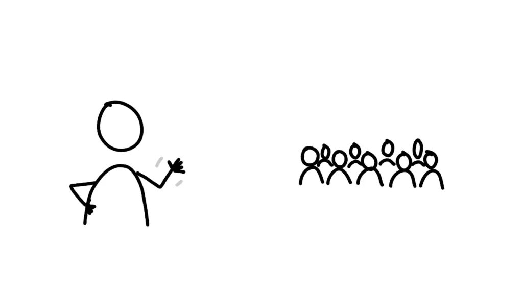
The U person features a head (usually a circle) above an upside down U. This can work for a person on their own, but is extremely useful to represent a crowd. It really helps that you can draw them very quickly.
Once you’ve got your U and head, you can add arms and other details.
The stick figure
If you doodled in your school books, there’s a good chance you had a stick figure or two!
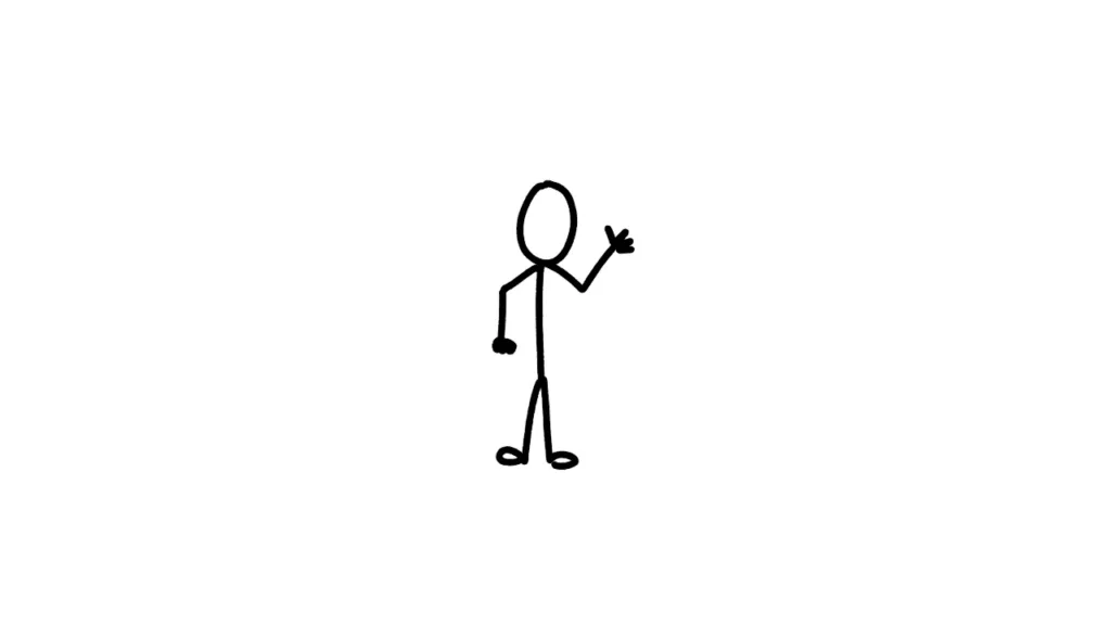
This incredibly simple person involves a stick body with a circle head, arms and legs. This approach has worked well for XKCD where every character is a simple stick figure with all personality and details on their head (more later).
You can adapt each part for different effects and that brings us on to the next type.
The shape figure
Instead of using a stick body, what about a shape?
Different shapes cause different effects.
- Circle
- Triangles in either orientation
- Squares and rectangles
Give them ago and look at the results.
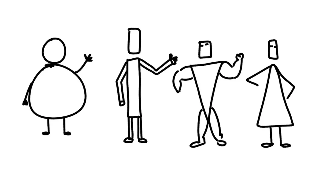
And don’t forget, you can also try different shapes for the head, arms and legs, each of which creates a new look. In fact, it can be a fun challenge to use only one shape to draw everything!
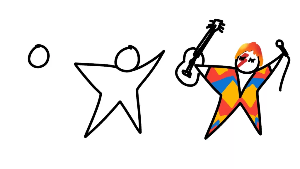
The star man
This technique was made famous by David Grey.
It’s related to shape figures but the Star man is a single shape that includes every part of the body. Just …
The expanded stick figure
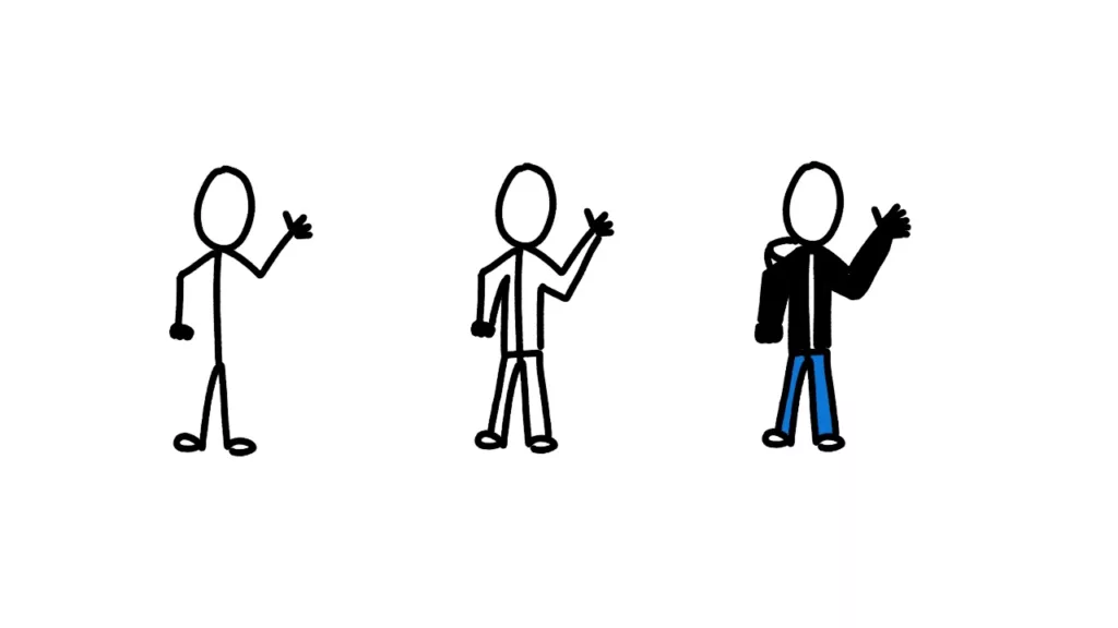
Perhaps the most accurate way to draw a person in a sketchnote.
Start with a simple stick figure, but then expand them to make them fuller figures.
The portrait
If you are listening to a talk or reading a book, why not include a portrait.
This is great for the key visual sketchnote layout but also works in the header area of a sketchnote. You can make them as detailed as you like, and details certainly help when it’s a large portrait!

(pro tip for digital sketch noters: you can import a photo and then sketch on top)
Common mistakes to avoid when sketchnoting people
There are a few common drawing traps you may fall into with people.
- Get the proportions of arms, body and head right
- Don’t put the arms too low on the body
- Be careful with where joints are
- HANDS!!!
Some of these just require more attention (such as placing the arms at shoulder height) while others can be simplified (like hands).
Simplifying has the added benefits of saving time when drawing and allowing the viewer to imagine themselves where the details are lacking. At the same time, a few details can add a lot of character.
What to do when you make a mistake!
If you are doing a digital sketchnote, it’s no problem.
In non-live sketchnoting situations you can hit undo, but in live situations you have options too.
The simplest solution is to leave the mistake where it is but come back later and add a new layer on top. You can use the previous attempt as a guideline but this time avoid the error. Alternatively, you can just erase the previous attempt but I find leaving a previous layer more useful.
For analog sketchnoting, you have a similar option to the layers.
Where possible, you can cover over the mistake and blackout the mistake. For example, if you place some arms too low on your stick figure, give it a t-shirt and you can cover the old arms and create new ones.
If you really can’t sketch over, you can stick some paper over the top and redo your sketch on that.
Who said only digital apps had layers!
Details which add character
You can stick with blank figures if you like but adding a couple of details will enhance your sketches a lot. Here are a few ideas to get you started.
- add shadows and outlines
- give them hair
- put a nose on their head
- add cartoon eyes
- dress them in clothes
- put them in a pose
- give them some thematic accessories
- include motion lines to show movement
- Add speech and thought bubbles
These are just a few options for you to consider as you draw your person. It’s worth considering what you can add after you finish your sketch to enhance your person (like hair!)
Don’t forget diversity!
When you start sketchnoting, your figures will probably look very basic.
Mine certainly did!
But as you started to add more features, you’re likely to fall into a trap: everyone looks like you! That’s not terrible as these are supposed to be personal notes, but if you want to share your notes with a wider audience, or you want to more accurately represent the people in your notes, you need to add some diversity.
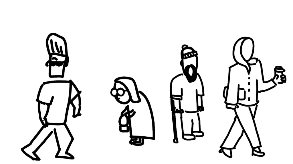
Some key forms of diversity to remember.
- Sex and gender
- Race
- Religion
- Age
- Sexual orientation
- Disability
Many of these can be represented with small details such as a certain hairstyle, clothing or accessory (for sex and religion). Changing someone’s posture and adding small details on a face can help show age. And you can also use different background colours to help show someone’s race.
The key is to find common characteristics without falling into negative stereotypes. To put it bluntly,
- giving an islamic woman a hijab is fine, but giving her a bomb isn’t.
- giving a jewish person a Yamaka is okay, but don’t make them obsessed with money and with a giant crooked nose!
A further point is that if you seek to add more diversity in general to your sketchnotes (i.e. people with different lengths of hair, skin colour, age) then you should cover your bases and represent people who don’t match a characteristic exactly (i.e. women with shorter hair, men with longer hair, extremely fit older people).
Have fun
None of us can match the image in our minds when we first start.
This can feel discouraging but we can also choose to view things differently. We can get excited about the opportunity to improve and provide a record of our improvements to encourage others too.
Plus, when mistakes are normal, it’s easier to experiment.
I hope this has given you some ideas for how you can draw people in your sketchnotes and you will have fun making mistakes.

Leave a Reply