My biggest obstacle to sketchnoting was arranging information. For a long time, I stayed making “Sketchnotes lite” where I had text (with occasional colour) broken up by the odd image. Discovering sketchnote layouts changed all that. Suddenly the shackles were off and my notes radically shifted.
This may not be the case for you; there may be a different area that holds you back like drawing. But understanding sketchnote layouts can help you plan and organise the content in your sketchnotes.
What are sketchnote layouts (and why do they matter)?
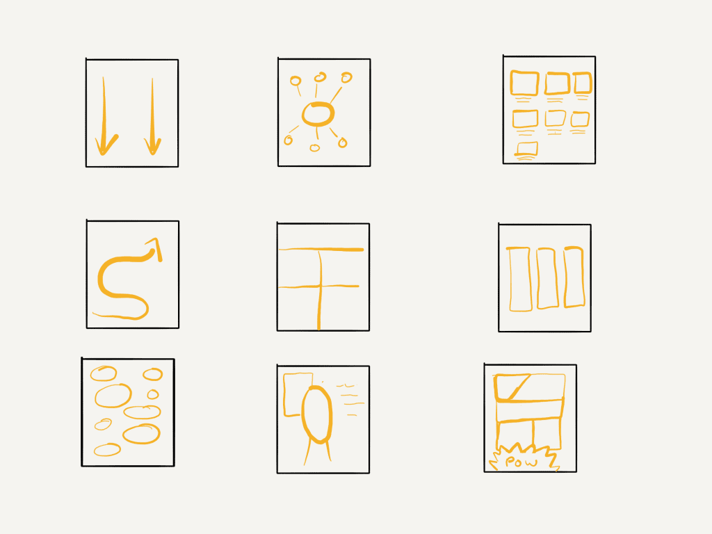
A sketchnote layout is a pre-determined way to arrange information in a sketchnote. They’re guidelines to help you arrange information so that it’s easier to understand, guides the reader and looks great.
By using a set layout, you reduce the cognitive load on your brain so you can focus more on the information that is being shared and how to represent it. They also help you anticipate spacing and timing so you don’t run out of room and make the most important information stick out.
10 common sketchnote layouts you must know
Although there are hundreds of variations, here are 10 of the most common that will help you improve your sketchnoting game.

Radial/mindmap
Although some people confuse mindmaps with radial sketchnotes, there is a subtle difference. Regardless, this layout has a central element and then spokes coming out from the centre. Radial mindmaps are great if you have a core topic or concepts.
Grid

The grid layout divides the page into squares with each square containing a single aspect. This is great for talks where there are clear division in content and works well when there are four or six items covered.
Columns
Columns group information together from top to bottom. You can use these a bit like a spreadsheet to show the same information for different items. It also works well for panel discussions.
Popcorn
The popcorn style involves random chunks of information across the page. This can be very handy when there isn’t perhaps a clear structure or logical flow (for example, question and answer sessions). It can help you gather your thoughts as well.
Portrait
The portrait layout involves a large, central image of the topic of the sketchnote. The rest of the sketchnote is usually information about this central figure. This works well for biographies of people as well as for food sketchnotes…can you make a portrait of a meal? Well, you can with a sketchnote.
The key idea
This is similar to the portrait as there is a large image usually in the center. It differs as this image is a metaphor for the topic of discussion rather than a representation of the subject. Some examples include
- An iceberg to represent the presenting symptoms and hidden causes
- A mountain to represent the struggle to reach a goal
- A bridge to represent an obstacle we need to overcome
This is more common for graphic recording and facilitating, but you can use it in your sketchnotes too. You could even use your key image as a container for the rest of the sketchnote.
Path

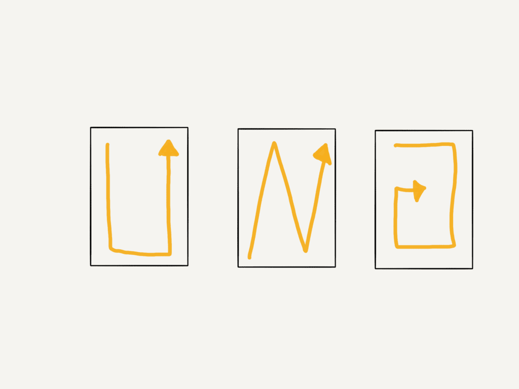
The path style shows progressions and time as we move from the start to finish. This can happen in a variety of different ways like a giant U, Zig Zagging, spiralling into the centre, or out from the centre, or just randomly across the page. This can work well to show how the order of a talk or the chain of events.
Flowchart
Flowchart layouts are a simple way to show information in a step-by-step manner, using all sorts of shapes and lines to connect ideas and show how they relate to each other. You can use boxes, circles, diamonds or whatever shapes you fancy, and link them together with arrows or lines that take the reader on a journey through the content. Flowcharts can go up, down, sideways, or even loop back on themselves to show a process going to a previous step. This layout is useful to show decision-making processes, or revealing the hierarchy of a particular topic.
Storyboard
A storyboard is used in cinema and TV to represent key parts of a story with images and dialogue below. For sketchnotes, this involves equal squares or rectangles with space for some text below.
Comic
Comics are very similar to storyboards except each frame can be a different size depending on the importance or requirements of the frame. This can lead to more dynamic sketchnotes.
Combining layouts
You don’t have to stick to one layout, you could use multiple for different parts of the sketchnote. For example, if you want to make a sketchnote on a part of history and three figures around that time, you could use columns on the left (for the people) and a timeline or path on the right for the events.
You could even use a grid layout with each grid being a different layout!
What if I choose the wrong layout?
If you are sketchnoting live and notice that the topic and information suit a different layout better, you have three options.
- Carry on anyway and embrace your creative limits
- Switch approach mid sketchnote and have a mix of layouts
- Start your sketchnote again and go back later to add in missing details
There’s no clear right approach and each has its pros and cons. With digital sketchnoting, the last option is far easier but it’s not impossible with an analog sketchnote.
If you do stick with “the wrong layout” you may find that it leads to a more unique sketchnote than if you had chosen the “right” one.
More?
There are more variations and unique ideas for layouts that grow all the time. The layouts above provide an overview and framework that you can adapt. And you can invent your own unique layouts too. What is your favourite sketchnote layout?

Leave a Reply