
We think that an accurate drawing is the easiest to understand. It’s not always the case with sketchnotes. Being a bit more creative and thoughtful by drawing abstract sketchnote icons can bring some real benefits that make your sketchnotes more interesting for readers and more useful for yourself.
Here are 3 reasons why you should get more creative with your next sketchnote icons.
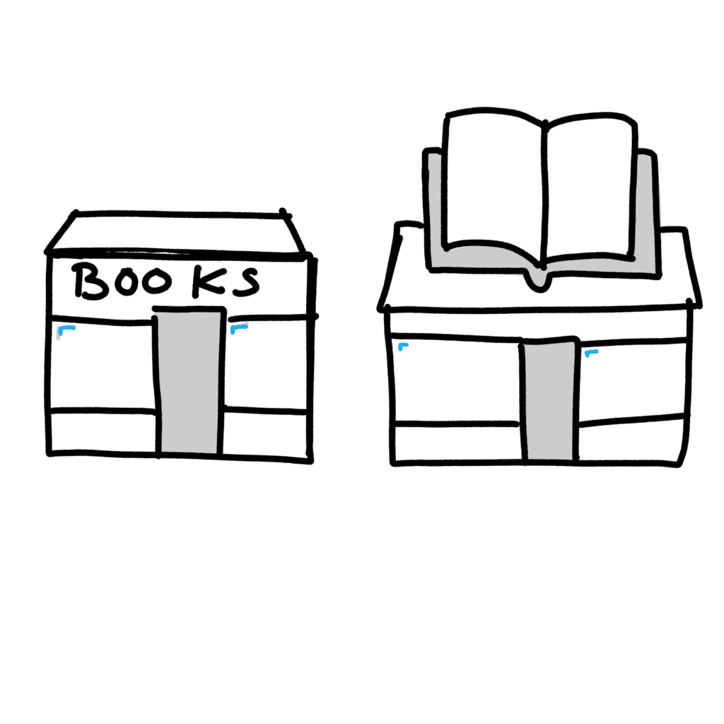
Easier to understand
You often need to draw small icons and too many details make them harder to make out. Plus the most details you add, the more of your opinion you add in. That’s a real issue if you want to talk about a category like a bookshop rather than the bookshop down the road which you go to.
Which is easier to understand and which has more character?
Want to learn how to draw anything in just 5 days? Sign up for this free course and you’ll learn fundamental sketchnote drawing skills which you can use to draw anything.
Adding character
This is even more important with abstract ideas that don’t have direct correlations in the real world.
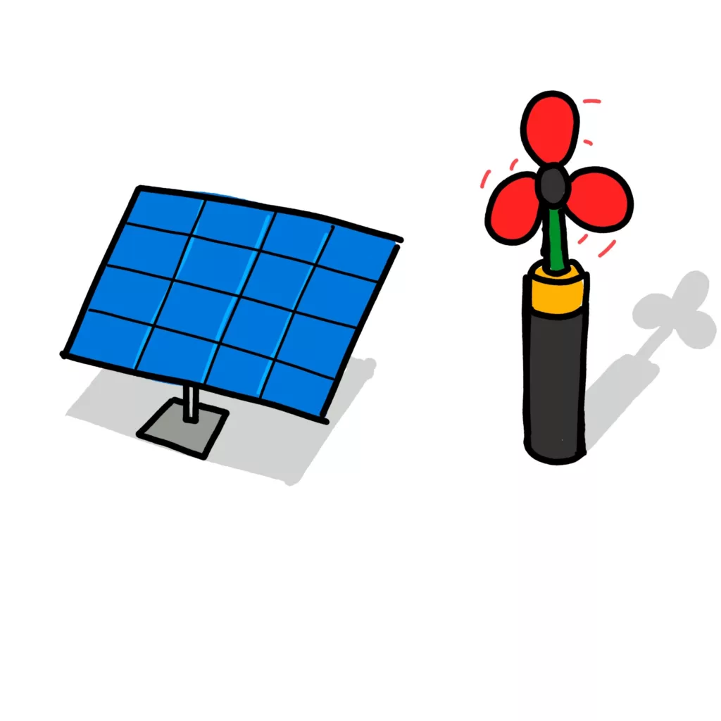
While you can think of a “thing” that represents the concept (like a lightbulb representing an idea), sometimes it’s better to get more abstract.
Take sustainable energy, which does a better job of expressing the idea? Which has more character?
Remembering more by thinking deeper
By combining multiple ideas, you also have to think more deeply about a concept. This works your brain harder which can cause deeper connections than going for the quick and easy idea.
Try more abstract sketchnote icons next time
So next time you come to draw an idea in your sketchnote, maybe you should go a bit more abstract sketchnote icons.
It might make it easier to understand, add more character and help you remember more.
Leave a Reply